


It’s the final battle of the domain venue giants to determine who’s doing the job right; User experience (UX) design is the quintessential element that can make or break a web site for its users.
So far we covered Afternic, Flippa, GoDaddy Auctions and NameJet; today’s the turn of Sedo, the German company with offices in the US.
Sedo offers the world’s largest selection of premium domains with more than 18 million available for sale, according to their own statement, so let’s see how they perform in the user experience design department.
For the sake of this report, we are using Sedo without logging in.
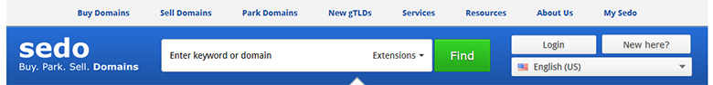
The top portion of the Sedo landing page is occupied by the navigational interface, split over two sections; the topmost one provides links to Buy, Sell and Park domains, New gTLDs, Services, Resources, About Us and My Sedo.
The bottom section contains the Sedo logo and motto – Buy, Park, Sell. Domains – the search box with filters, a login button with a help link and a language changer.
The use of contrasting colors – gray/blue – for the top section and the ample spacing of the text, images and forms make the navigation very pleasing and effectively functional. Every navigation option can be expanded via a drop down menu as well.
What follows is the so-called “hero graphic“, highlighting distinct segments of the Sedo inventory as presented by the marketing team’s research; the images sit on a rotating carousel with 5 sections in total. That area follows the overall Sedo approach of delivering fact snippets and links to events, but it’s a bit taller than necessary, stealing premium real estate from the content below.

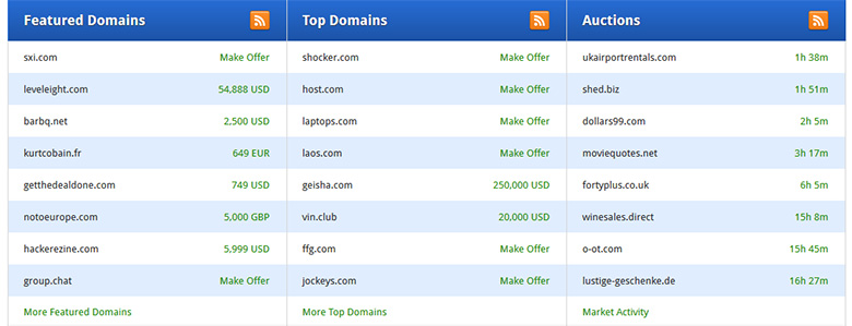
The domain goodies follow, in a section that is split vertically into three columns: Featured Domains, Top Domains and Auctions. Each section has its own RSS feed, a great feature that allows third parties to incorporate the inventory on web sites or apps.
Each domain row is displayed in alternating background color, with an indicator of its price or remaining time for the auctioned domains. There are links to the full inventory as well. Overall, a very nice presentation that is compact yet very informative and inviting to explore further.
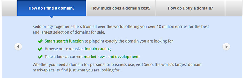
The next segment presents information across three primary subjects that can be navigated via tabs or in a directional manner: How do I find a domain, How much does a domain cost, and How do I buy a domain.
These informational calls to action serve the functions of Sedo very well; the content is concise, accurate and it outlines the information that visitors need in order to get started. Sedo has thus presented answers to their top 3 FAQ’s in a very effective manner.
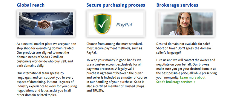
Right below that section we find a layout of three columns that follows the overall grid design dedicated to the Sedo home page. Global Reach, followed by Secure purchasing process and Brokerage services, are the subjects of these sections. Each one offers an expanded, direct look into what Sedo does and how it does it. It’s one of the best approaches to upsell services, as well.
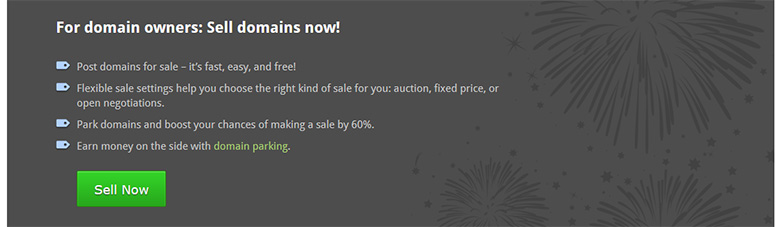
Presented in an inverted, contrasting color, the following section is another prompt to utilize the services of Sedo, currently dedicated to domain owners that want to sell their domains. The benefits of using such services are outlined via the use of bullet points. Top points for this approach and for the contrasting color scheme that sets it aside from the surrounding areas.
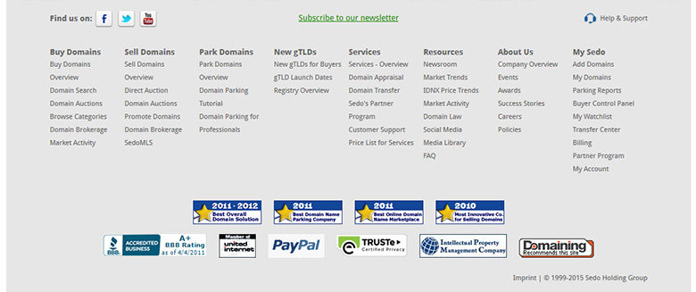
The 7th and final segment (!) of the Sedo home page packs a lot of information, but that’s alright, as we’ve reached the bottom of the page, where users can spend some extended time after perusing the main parts.
Instead of congesting the top part, Sedo has expertly included all the little bits and pieces in easy to read columns, expanding every part. The bottom section is filled with icons for industry awards and associations. We see the familiar recommendation icon by Domaining.com as well.
So how does the Sedo web site rank in terms of design, user experience, ease of navigation and overall presentation of domain inventory?
Here are the rankings for Sedo, available from Sedo.com :
Design: 9/10
User Experience: 10/10
Ease of Navigation: 10/10
Inventory Presentation: 9/10
Overall Ranking: 9.5/10
Sedo achieves an almost perfect score by sticking to modern UX design principles, delivering its primary content in nicely padded segments that follow a grid layout.
Undoubtedly, the sheer size of the Sedo inventory would not permit for more content to be included on the home page, without extending the height of the page considerably. The goods exist inside, and as we’re comparing the landing pages, Sedo should be confident in knowing that they have done a great job.